
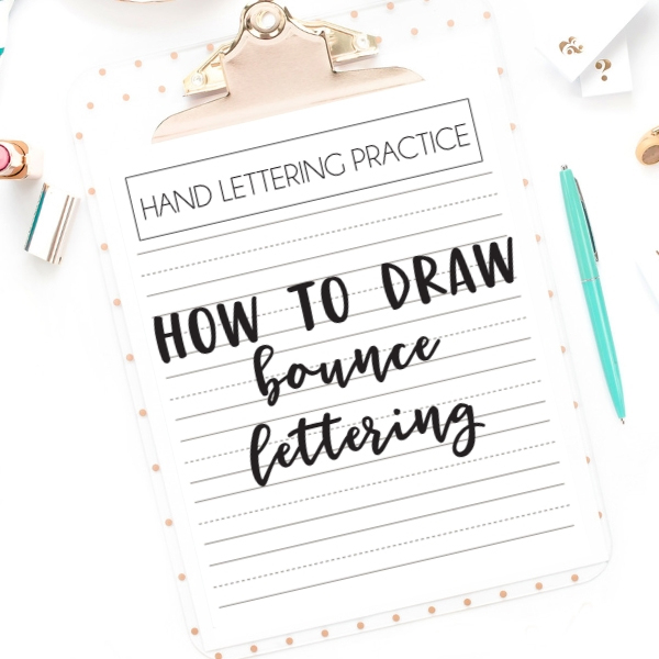
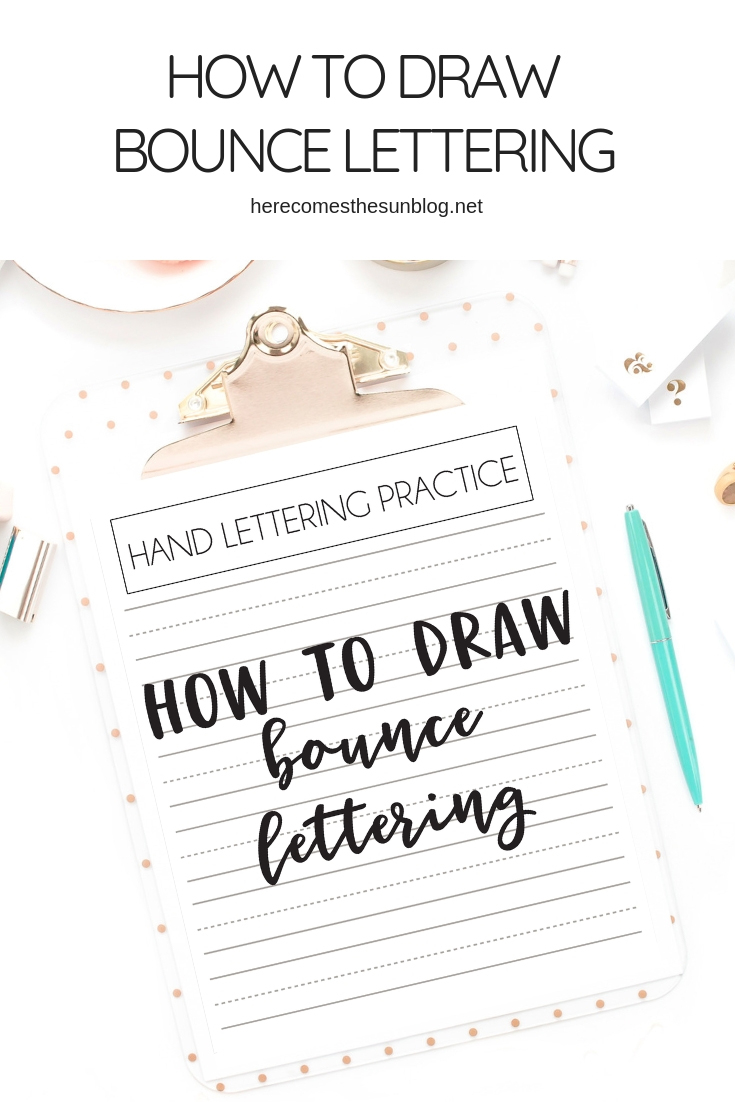
How to Draw Bounce Lettering
Bounce lettering will take your hand lettering to a whole new level. This tutorial will teach you how to draw bounce lettering into your designs.
By now, you’ve seen hand lettering everywhere. It’s on signs, journals, cards…everything. Pinterest is pretty much filled with it. There are so many different hand lettering techniques and today I’m going to teach you how to draw bounce lettering.
HAND LETTERING SUPPLIES
In order to practice bounce lettering, you’re going to need a few supplies. These are the supplies that I recommend:
HAND LETTERING PENS
First and foremost, you will need a proper hand lettering pen. I recommend Tombow Dual Brush Pens and also the Tombow Fudenosuke. There are many different hand lettering pens on the market but these are the brand that I use and I feel most comfortable with them.
PAPER
You will also need some high quality paper. Some people use regular copy paper but I have not had good luck with it. My markers seem to bleed more on copy paper and sometimes there is a “pilling” effect on the paper. I recommend Canson Mixed Media Paper.
HOW TO DRAW BOUNCE LETTERING
If you need to review hand lettering basics, check out this post.
WHAT IS BOUNCE LETTERING?
First let’s learn some definitions:

Baseline: This is the line that the base of every letter sits on unless it has a descender (lowercase g ,j, p, q)
X Height: The height of lowercase letters unless they have an ascender (b, d, f, h, k, l, t)
Cap Height: The height of capital letters
Ascender: The highest point that the lines of b, d ,f ,h, k, l and t extend to
Descender: The lowest point that the lines of f, g, j, p, q extend to.
Next, we have to look at what bounce lettering is NOT. This is not bounce lettering (the bottom lines). In the example on the bottom, the lettering is straight and stays within the confines of the lines. This is basically the way we all learned to write cursive.
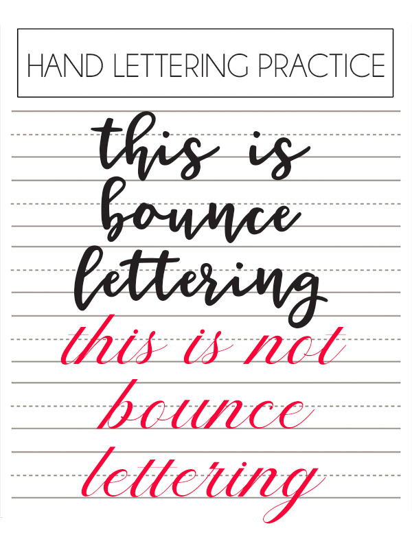
Take a look at this lettering at the top. Notice anything different? These letters do not stay within the lines. Bounce lettering is when your lettering “bounces” on the page. The letters flow and dip up and down, breaking the “rules” of where they should be. Bounce lettering gives your artwork a lot more interest.
BOUNCE LETTERING TIPS
When you are new to bounce lettering, it may seem very intimidating. We are taught to write in a straight line and in order to create bounce lettering, you have to break the rules and draw outside the lines. For some of you rule-breakers, this may come very naturally. I would suggest sketching out your text with a pencil until you like the way it looks. Or you can hand letter on an iPad Pro which makes it very easy to erase and start over.
There is no right or wrong way to draw bounce lettering. It just takes practice which is why I created a fun practice sheet for you. The practice sheet is located in the resource library which is available o my email subscribers.
LOVE IT? PIN IT!
YOU MAY ALSO LIKE
LEARN HAND LETTERING: THE BASICS
HOW TO HAND LETTER ON THE IPAD PRO
HAND LETTERING PRACTICE SHEETS
HAND LETTERING PRACTICE SHEETS FOR BEGINNERS
FALL THEMED HAND LETTERING PRACTICE SHEETS
SUMMER THEMED HAND LETTERING PRACTICE SHEETS
Hi,
I‘d love to learn bouncy lettering.
Thanks.
Best wishes
Susanne